ADVANCED TYPOGRAPHY Task 3: Type Exploration & Application
week9-week14
Jin Rong/0361701
Advanced Typography / Creative media in design
TASK 3 Task 3: Type Exploration & Application
LECTURES
All lectures 1 to 5 completed in Task 1
INSTRUCTIONS
TASK 3: Type Exploration & Application
For this task, we are to choose a direction to head in:
1 Create a font to solve a larger problem or meant to be part of a solution in an area of interest;
2 Explore the use of an existing letterform in an area of interest, improve upon and explore possible solutions;
3 Experiment. Identify potential weaknesses or possible areas of further exploration or experimentation in an area of interest, and provide a creative solution or add value to an existing use by working with materials.
1. Idea Proposal
2. Idea Development
Before I started drawing fonts, I searched for similar fonts on dafont to study them. Find some inspiration for my font.
3.Digitalisation
The letters B and C were made according to the size of letter A, and I also drew their shapes for them
When making the letter M, the middle part of my initial design appeared too crowded. To solve this problem, I tried some subtraction processing by reducing the middle part to make the overall effect more balanced
Similarly, when making the letter W, I also used this method to make it more coordinated
In Adobe Illustrator, I used the brush tool to draw shapes. Then, I applied the 'Object > Expand' function to convert the dynamic brush strokes into static vector shapes, and worked on the fill and stroke.
Lowercase
I drew the lowercase letter a and set the height of most lowercase letters, such as the letters c, e, n, and m. Meanwhile, I resized a portion of the letter a to create the letter l.
When making lowercase letters, my design is very smooth and can use many shapes from when making uppercase letters before. For example, I also used the half arc shape made for uppercase letter B in lowercase letters b, d, h, m, n, and so on
Numbers
In order to distinguish the letter O from the number 0, the height of the number 0 was increased and the internal shape was adjusted.
punctuation
I did punctuation with 【】-_+=%?.,@
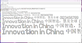
When I tried to import fonts into FontForge, I found that the effect I wanted couldn't be achieved
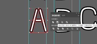
To achieve the desired effect, I created a cutout using the Pathfinder tool's 'Minus Front' function.
Illustrator workspace
FONTFORGE
Import fonts and resize them
Adjust the y-axis of individual lowercase letters
All final generated fonts
Final Font Design
Downloadable font link:DUOLINE
4. Font Presentation
Font Application
I use mockey to create
FEEDBACK
observation
During the production process, I encountered many problems that required me to search for tutorials on-site and solve them. When making fonts, I have found that consistency in thickness, strokes, and style is crucial in font design. Even small changes can disrupt the overall integrity of the font. Meanwhile, adjusting the size and position of each letter to ensure reasonable spacing and spacing between letters is also a crucial step.
Findings
I realized that my skills in software usage are relatively weak. I don't know many tools, and sometimes I end up using more complex ways to do something simple. What I can do is search for tutorials online to solve my problem. I will spend more time studying during the upcoming holidays.
FURTHER READING
primary coverage
This book comprehensively introduces the basic principles and practical applications of font design. The book provides detailed guidance on font selection, layout, and application in different media. Of particular note is the addition of a chapter on dynamic font design in the new version of the book, showcasing the latest design trends and technologies.
Learned knowledge
The importance of consistency: The book repeatedly emphasizes the importance of consistency in thickness, strokes, and style in font design. Even small changes can affect the overall harmony and beauty.
Details determine success or failure: Adjusting the size, spacing, and spacing of each letter is an important step in ensuring a beautiful font. The author demonstrates through numerous practical cases how these details affect the final outcome.
New Trends and Technologies: The book contains the latest design trends and technologies, particularly in their applications in dynamic and digital media. This is very helpful for me to understand modern design.


评论
发表评论